You Can Use Gestalt and Design Principles Together to Increase Visual Hierarchy
When you think of psychology and design, often it is understood they are two entirely separate fields of study. However, many people are surprised to find out they are closely related. Design uses many principles of psychology to help guide, influence, and predict the actions of users. Gestalt is a psychology term which means “unified whole.” It refers to theories of visual perception developed by German psychologists in the 1920s. These theories attempt to describe how people tend to organize visual elements into groups or unified wholes when certain principles are applied. We’ll cover a few of these principles and see how they can be used to create visual hierarchy. Visual hierarchy refers to the arrangement or presentation of elements in a way that implies importance.
Similarity
The principle of similarity states that if all else is equal, our eyes perceive shapes that resemble each other as a part of the same object. In contrast, shapes that are dissimilar are seen as different objects. This allows people to distinguish between adjacent and overlapping objects based on their visual texture and resemblance. When there are objects or shapes with different features or textures, those objects are generally not perceived as being a part of the whole object. Our brain uses similarity to distinguish between objects that might lie adjacent to or overlap with each other based upon their visual texture.
In these examples, similarity is used in two separate ways. Let’s start with our base. Currently, we see an 8 x 8 “square” made of circles.
.

Next, let’s look at similarity using color. We have the same 8 x 8 “square” of circles as above. However, by using color our eyes now group them into 4 rows of orange and 4 rows of blue.

The same effect applies when we use the same color, different shape as seen below.

Proximity
Proximity is defined by shapes that are closer together are perceived as being the same object and objects further away are seen as a different independent figure. Below our eyes perceive a 4×8 “rectangle” on the left, and a 1×8 figure to the right.
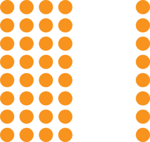
The principles of similarity and proximity often work together to form a Visual Hierarchy. Either principle can dominate the other, depending on the application and combination of the two. For example, in the grid below, the similarity principle dominates the proximity principle and you probably see columns before you see rows.

Closure
Closure occurs when an object is incomplete or a space is not completely enclosed. If enough of the shape is indicated, our eyes perceive the whole object by filling in the missing information. Although the S in the logo below isn’t actually there, our eyes still perceive it because just enough visual information is available for the eye to complete the shape. When the viewer’s perception completes a shape, closure occurs.

Common Fate/Motion
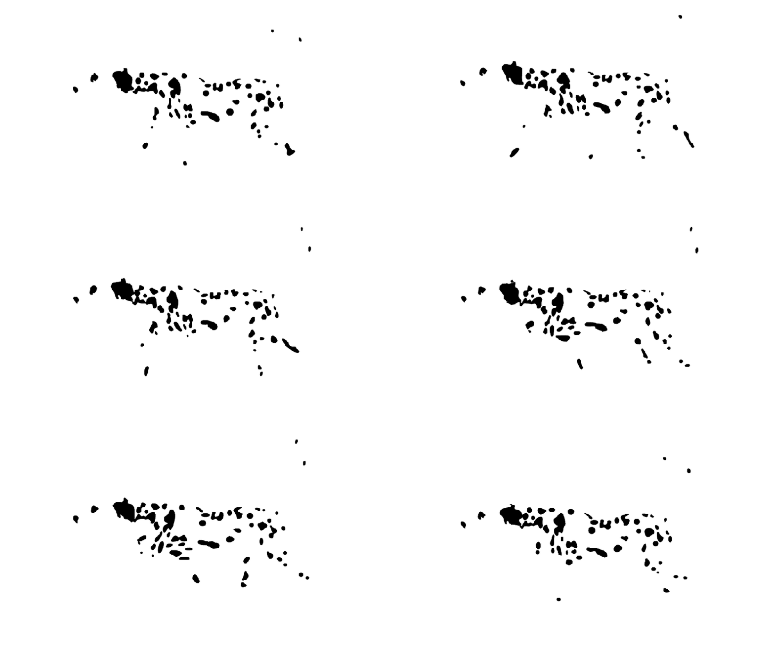
When visual elements are seen moving in the same direction at the same rate, otherwise defined as optical flow, our eye perceives those movements as part of the same object. This allows people to make out moving objects even when other details (such as the object’s color or outline) are obscured. This ability likely arose from the evolutionary need to distinguish a camouflaged predator from its background.
The law of common fate is used extensively in user-interface design, for example where the movement of a scrollbar is synchronized with the movement of a window’s content viewport.
The example below uses both common fate and closure to create the illusion of a Dalmatian dog running.
Scale
Scale refers to the visual perception that an object appears larger or smaller in size in relation to surrounding elements. Scale is the easiest way to establish visual hierarchy because our eyes are naturally drawn to the larger focal point.

As you can see, these principles are universal and have a multitude of applications. Keep these principles in mind the next time you are laying out your blog, website, mobile app, book cover, t-shirt design or social media images. Visual hierarchy is your friend and allows you to control the way your users perceive and interact with your content. As always QBR is here to help and you can contact us here!
