We can’t stress enough how important it is to make a good first impression. Strolling down your local Main Street isn’t the only way people check out stores and other small businesses nowadays. With routine visits to Yahoo, Bing, Google, Yelp and other online sites, customers are constantly seeking where they plan to make their next purchases. You want to be sure that your business’s website is user-friendly and well represented to get the most out of your website. These are five of the most common web design mistakes small businesses make.
1. Your website design is too busy, cluttered or flashy
Good website design begins with the user and target audience in mind. In 3 seconds your user should be able to determine your brand and what your business does. If the user can’t determine what your business offers or what they should do next on your website, they are likely to click away.
A 2015 study conducted by Microsoft found that the average human attention span has declined from 12 seconds to 8 seconds. This means that humans now have a shorter attention span than goldfish. Designers need to adjust to cope with this behavior, with the goal of getting people the information they need as quickly as possible.
Start by simplifying your website design by removing unnecessary elements or content that does not support your user’s needs. A great technique for this is functional minimalism.
2. No clear call to action
Good design takes the guesswork from the user. When they visit your site, the design of your website should guide them through the desired call to action. Do you want them to buy your product, contact you, or subscribe to your business e-newsletter? Your content should answer the question, “What’s in it for me?” and then the call to action tells them what to do next.
Consider a website for an electric bill company. Let’s face it, most of their consumers are going to want to go to their site to pay their bill online, not learn about the company itself. When the user visits the website and there’s no clear call to action, the user can’t figure out where to go to pay their bill online in 3 seconds, therefore, resulting in a poor user experience.
3. Outdated content
Customers expect your website to contain the latest information about your products, services, and company. In order for an increased ranking in Google and other search engines, you must be seen as an expert in your niche and this requires updating the content of your website. See our blog on SEO for more information.
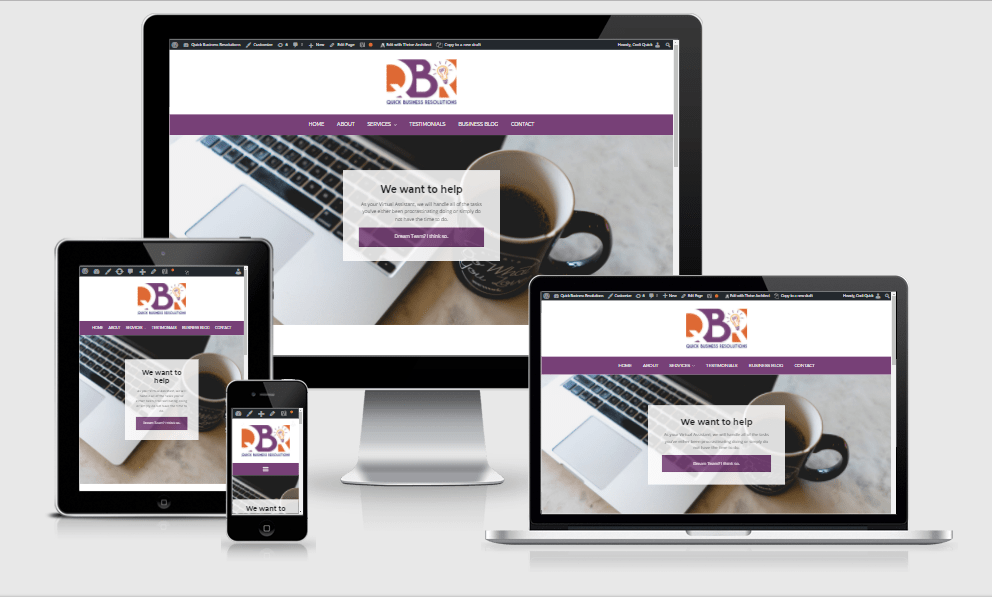
Not only is your content outdated, but it is possible the code that is used to build your website is as well. Consider how websites used to look in the early 2000’s compared to today. You want to make sure that your website utilizes responsive web design, meaning that your website adapts and looks good on any device. Knowing how your website will appear on a variety of devices helps you predict how users are interacting with your content. In extreme cases, you made need to rebuild your website if the code is too outdated.
Quick Tip: You can use this tool to see if your website is built using responsive website design. If the appearance of the text, images and menu change as the device screen gets smaller, the site is responsive.

4. DIY website
Your website is often your customers’ first experience and interaction with your business. There are several website builders out there like Wix and Squarespace, but they have limitations and don’t always meet your business’s needs. These websites also use templates which lack full customization, so your website blends in with the competition. Don’t allow your customer to make assumptions about your business because of a poorly designed website.
5. Paying too little or too much.
If you pay too little to have your website designed, the result is often lackluster and you end up having to pay even more just to have it fixed. On the flip side, many businesses get distracted by expensive design agencies that work with big brands and don’t realize that these agencies aren’t able to help an ROI focused small business. A good website doesn’t have to cost an arm and a leg, but it is important to do your research to ensure you will be receiving a quality product.
Do any of these mistakes apply to your business’s website? Let us know! QBR is here to help small businesses like you and help you get the most out of your website!
